WWDC25: Meet the Foundation Models Framework | Apple
Discover Apple’s Foundation Models framework, enabling powerful on-device large language models across macOS, iOS, iPadOS, and VisionOS with privacy-first, efficient AI integration for developers.
Explore Apple's new Liquid Glass design system unveiled at WWDC25, redefining visual design, structure, and continuity for seamless, adaptive apps across all devices.


The latest design system unveiled by Apple at WWDC25 represents a transformative leap in how the interface and content harmonize across devices. This comprehensive update, known as Liquid Glass, redefines visual design, information architecture, and core system components to create a more cohesive, adaptive, and expressive user experience. At its core, Liquid Glass is not just an aesthetic shift; it is a holistic approach to system design that scales fluidly across iPhone, iPad, Mac, and beyond. This article delves deeply into the innovations introduced, exploring the nuances of the new design language, the structural shifts guiding navigation and content engagement, and the continuity principles that unify interactions across platforms.

At the heart of Apple’s design evolution is Liquid Glass, a system that reshapes the relationship between interface elements and content through a fresh set of heuristics. This approach fosters familiarity across platforms while tailoring each experience to feel perfectly calibrated. The design language is no longer just about isolated components; it is about creating a rhythmic, unified visual experience that resonates with the physical precision of Apple hardware.
One of the most compelling aspects of this new design language is the meticulous attention to detail. Every element, from the smallest control to the largest surface, is designed with intention and in relation to the whole system. This systemic mindset ensures that the interface feels balanced and harmonious, fostering an emotional connection rooted in subtlety and precision.

The system colors have undergone subtle but meaningful adjustments to work seamlessly with Liquid Glass across light, dark, and increased contrast modes. These refinements enhance hue differentiation without sacrificing the optimistic and vibrant spirit traditionally associated with Apple’s palette. This nuanced color tuning improves accessibility and visual clarity, ensuring the interface remains legible and inviting under various viewing conditions.
Typography also plays a pivotal role in the new design language. Apple has made fonts bolder and aligned text to the left to boost readability, especially in critical moments like alerts and onboarding. This shift not only strengthens clarity but also reinforces the structural hierarchy of information, guiding users effortlessly through the interface.
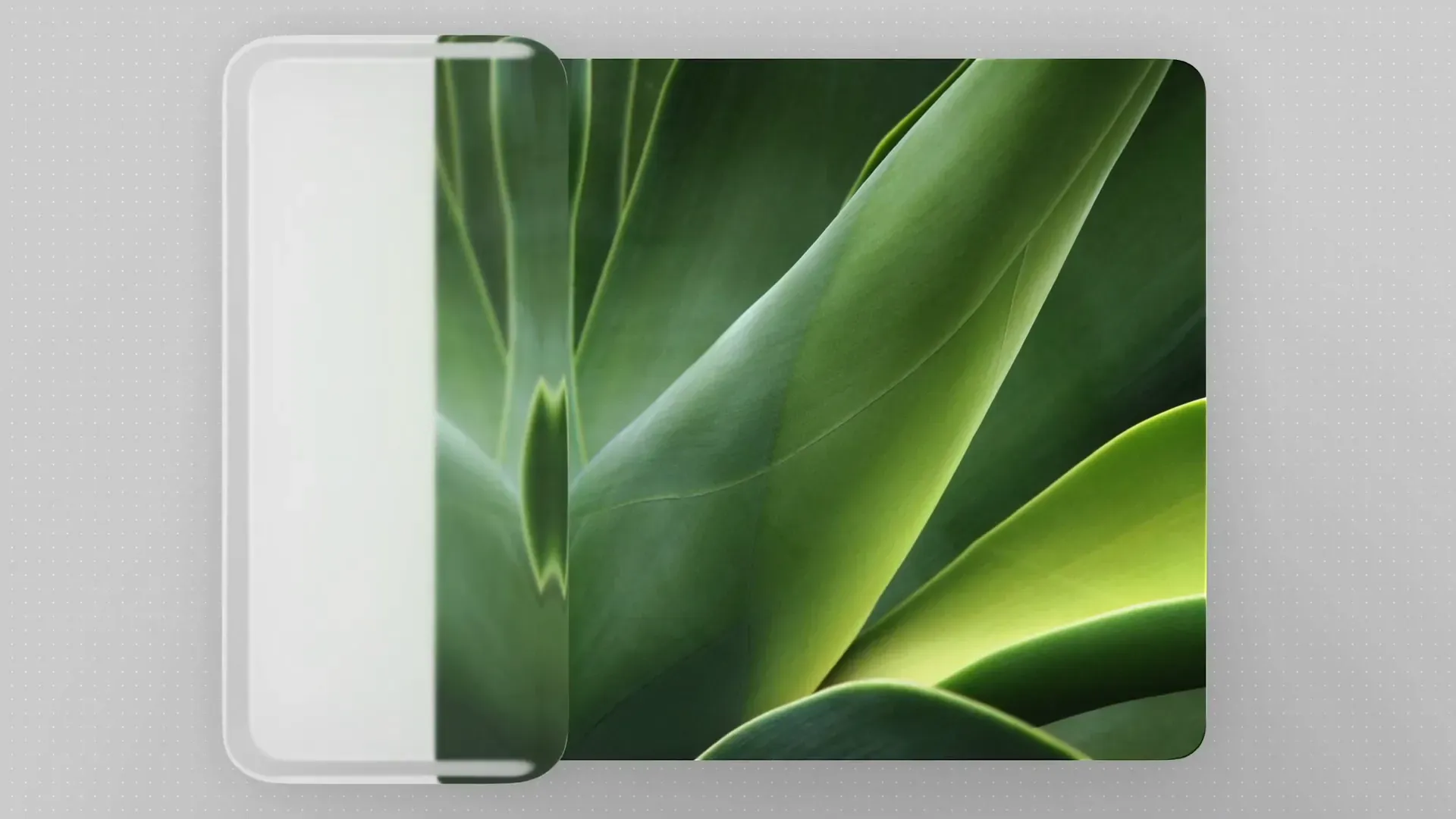
One of the most innovative changes is the new use of shapes guided by principles of concentricity—a design concept where radii and margins align around a shared center. This creates a quiet geometry where shapes nest comfortably within each other, producing a visual rhythm that mirrors the physical precision of Apple hardware, such as the consistent bezel curvature.
The system employs three primary shape types to build concentric layouts:
Capsules are particularly significant because their geometry supports concentricity intuitively. This is why capsules appear frequently throughout the system—in sliders, switches, bars, buttons, and the rounded corners of grouped table views. Their form brings focus and clarity to touch-friendly layouts, making them ideal for iOS and iPadOS.
On macOS, where screen real estate is dense and users expect compact interfaces, smaller controls retain rounded rectangles, which suit high-density environments like inspector panels. Meanwhile, larger controls embrace capsule shapes, including a new extra-large size that leverages Liquid Glass to emphasize spacious interface areas. The combination of these shapes creates a balanced hierarchy across complex desktop layouts.

For developers and designers managing their own visual systems, harmonizing with Liquid Glass is crucial. Apple likens this to playing in the same musical key—interface elements should complement the system’s rhythm and tone rather than clash with it. This harmony is essential for creating seamless user experiences that feel native and integrated.
Using the three shape types ensures alignment with system heuristics and simplifies working with Apple’s APIs. It’s important to avoid visual tension caused by corners that feel too pinched or flared, which often occurs in nested containers or near device edges. For example, artwork inside a card should use concentric shapes to allow the system to calculate inner radii automatically, preserving optical balance.
Near screen edges, such as on phones, capsules with extra margin create comfortable spacing, while on iPad and Mac, concentric shapes align with window edges for better visual balance. A clever technique for components that must work both inside containers and standalone is to use concentric shapes with fallback radii, adapting dynamically to context.
As apps grow more immersive and content-focused, the user interface must support interaction only when necessary and remain unobtrusive otherwise. Liquid Glass introduces a functional layer that floats above content, providing structure and clarity without stealing focus.
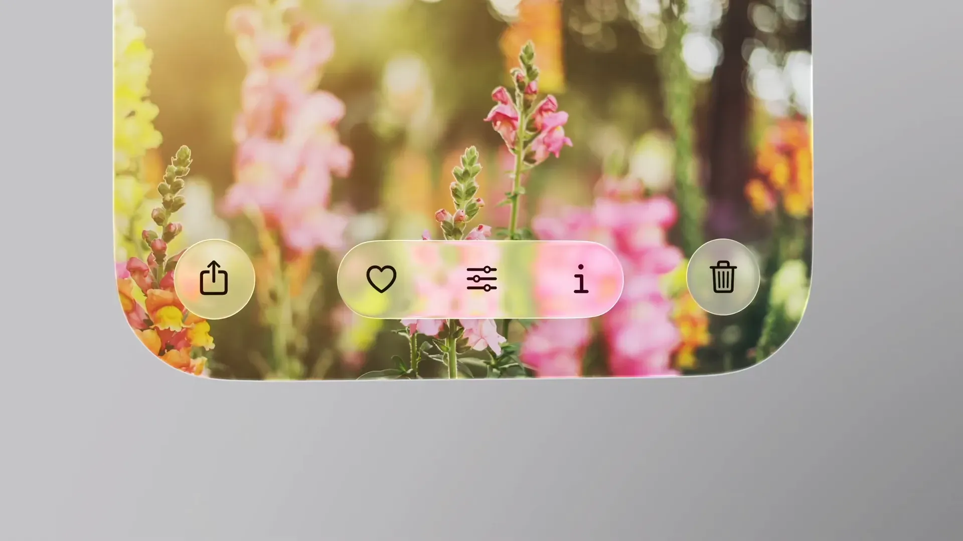
One key innovation is how Liquid Glass depicts relationships between UI surfaces. These surfaces anchor interactions spatially yet feel grounded, enhancing user comprehension of navigation flow. For instance, the action sheet no longer appears arbitrarily at the screen bottom; instead, it springs directly from the tapped action itself, which acts as its source.
This spatial anchoring clarifies the interaction’s origin and purpose, reinforcing the connection between content and controls. When creating custom controls, designers are encouraged to apply the Liquid Glass material directly to the control rather than its container, ensuring clarity and consistency.

Liquid Glass also enhances navigation focus by introducing subtle material variations that reinforce intent as users deepen or shift their navigation path. This builds on familiar UI cues like dimming layers used to signal modality when sheets appear.
When a task interrupts the main flow, pairing Liquid Glass with dimming layers centers attention on the sheet, creating a purposeful, clear space. Conversely, when tasks occur in parallel, Liquid Glass provides natural separation without breaking flow, maintaining context.
Interactions like dragging a sheet upward trigger Liquid Glass to recede subtly, becoming more opaque and expanding gently to signal a deeper engagement level. This dynamic response adds an intuitive sense of depth and focus that guides users naturally.
Previously, navigational controls often blended into backgrounds when interfaces were at rest, diminishing their discoverability. Liquid Glass lifts these controls, creating separation from content and reinforcing their interactive nature.
Designers are advised to clean up customizations on bars, removing extra backgrounds or borders previously used to add weight. The new system appearance expresses hierarchy through layout and grouping rather than decoration, leading to cleaner, more legible interfaces.
Grouping bar items by function and frequency enhances spatial clarity. Buttons performing related actions should be grouped but symbols should not be mixed with text if it risks confusion (e.g., a “select” label with a “share” icon might appear as a single button). Text buttons should have their own containers, with primary actions like “Done” appearing separately and tinted for emphasis, often blue on iOS and iPadOS or prominently on macOS.

The tab bar remains a persistent element that anchors navigation, giving users a clear sense of layout and enabling smooth transitions between app sections. Recognizing the importance of search, iOS now includes a dedicated search tab at the bottom, improving accessibility and quick reach.
Tab bars can also host persistent features through accessory views, such as media playback controls visible across the app. However, screen-specific actions like checkout buttons should remain contextual to their content to avoid blurring hierarchy and confusing users about what is persistent versus contextual.
Liquid Glass elements require clear separation from content to maintain legibility. Controls should sit on system materials rather than directly on content, as seen in Safari today. Scroll edge effects replace harsh dividers with subtle blurs, reducing clutter and clarifying where UI meets content.
Scroll edge effects are functional, not decorative—they don't darken or block content but clarify boundaries. They appear automatically when pinned controls overlap scroll views and come in two styles: soft and hard. Soft edges are the default for iOS and iPadOS, offering gentle transitions ideal for interactive elements. Hard edges, primarily on macOS, provide stronger boundaries for interactive text or pinned headers.
Consistency in height is critical when applying edge effects in split view layouts to maintain alignment. Sidebars have also evolved, now built with Liquid Glass and inset to allow content to flow behind them for an immersive feel. Background extension effects enable content like hero images or tinted backgrounds to fill the full width behind sidebars, enhancing visual depth while ensuring text and controls remain layered on top for clarity.
Scroll views extend beneath sidebars by default, allowing content carousels to glide naturally and support discovery without interruption. These effects can be applied per view, granting designers flexibility to craft richer, more engaging layouts.
While design language builds cohesion and structure shapes action, continuity knits the user experience into a seamless flow across devices. The core philosophy is simple: users should never feel like they are starting over when switching devices or resizing windows. Instead, the same task continues uninterrupted, preserving the user’s moment and momentum.

Understanding device context is foundational to achieving continuity. iPhone offers a narrow vertical layout focused on immediacy, Mac provides a wide, expansive canvas for depth and complexity, and iPad bridges these worlds with a middle layer that enables designs to scale effectively.
This tiered system stack encourages designers to think about how layouts adapt and scale rather than reinventing the wheel for each platform. Designing the anatomy once and allowing it to flex across devices simplifies the process and ensures consistency.
Shared content is the lifeblood of continuity. When content is intentionally grouped, it should remain grouped even as layouts adapt. Using consistent symbols across platforms preserves meaning and builds familiarity through repetition. However, it is vital to recognize that not all actions are self-explanatory through icons alone. For example, a pencil icon might suggest annotation, and a check mark might imply confirmation, but actions like "select" or "edit" can be ambiguous.
In such cases, text labels are preferable to avoid misinterpretation. Bars and menus are trending toward symbol-heavy designs, but designers should populate menus with symbols only where they aid recognition. For closely related actions, using a symbol once to introduce a group and relying on text to differentiate items prevents icon overload and confusion.
The updated icons page in Apple’s Human Interface Guidelines provides a helpful list of preferred glyphs for common actions, serving as a valuable resource for integrating SF Symbols or mapping custom icons to system standards.
Ensuring continuity across devices requires components to be structured for scalability and consistent behavior. This involves defining a shared anatomy where parts of component layouts persist and are reused in familiar placements.
For instance, sidebars and table items share layout principles, and menus follow a similar pattern. Though a popup menu on macOS and a context menu on iOS may differ visually, both include a selection indicator, icon, label, and accessory item, maintaining functional consistency.
Behavioral uniformity is equally critical. Components like tab bars, segmented controls, and sidebars signal selection, navigation, and state in consistent manners, providing identical functions and feedback cues regardless of form factor. This not only bridges platforms but also unifies related components within each platform, making the entire system feel cohesive and intuitive.

Apple’s Liquid Glass design system marks a pivotal evolution in software design by blending visual refinement, structural clarity, and cross-device continuity into a single, cohesive framework. The meticulous focus on concentric geometry and shape harmony bridges the gap between hardware precision and software fluidity, creating interfaces that feel both natural and sophisticated.
Structurally, the new system prioritizes user engagement by floating functional layers above content, anchoring interactions spatially, and introducing dynamic material behaviors that guide focus without overwhelming. This approach respects the content-first philosophy that modern apps demand, enabling interfaces to support interaction only when necessary and recede gracefully otherwise.
Continuity extends this philosophy across devices, ensuring users experience seamless transitions and consistent interactions whether they switch from iPhone to Mac or resize a window on iPad. By defining shared component anatomies and behaviors, developers can create flexible designs that scale elegantly and maintain familiarity.
Ultimately, Liquid Glass is more than just a design update—it is a strategic foundation for the future of Apple’s ecosystem, empowering designers and developers to build apps that are adaptive, accessible, and beautiful. Embracing this system requires a thoughtful balance of adherence to new standards and creative expression, harmonizing custom designs with Apple’s rhythm.
As the Apple ecosystem continues to evolve, Liquid Glass sets a new benchmark for interface design that is both deeply human and technologically advanced, inviting creators to explore its possibilities and craft experiences that resonate across every screen.

Explore the latest Swift updates from WWDC25, including workflow improvements, modernized libraries, and new language features that boost concurrency and performance.

Discover the latest SwiftUI features from WWDC25, including Liquid Glass design, performance enhancements, 3D layouts, rich text editing, and web content integration.

Explore the latest advancements from WWDC25 Platforms State of the Union by Apple. Discover unified development, performance enhancements, new developer tools, and future platform innovations.